Beauty / Personal Care
Tozaime Facecare
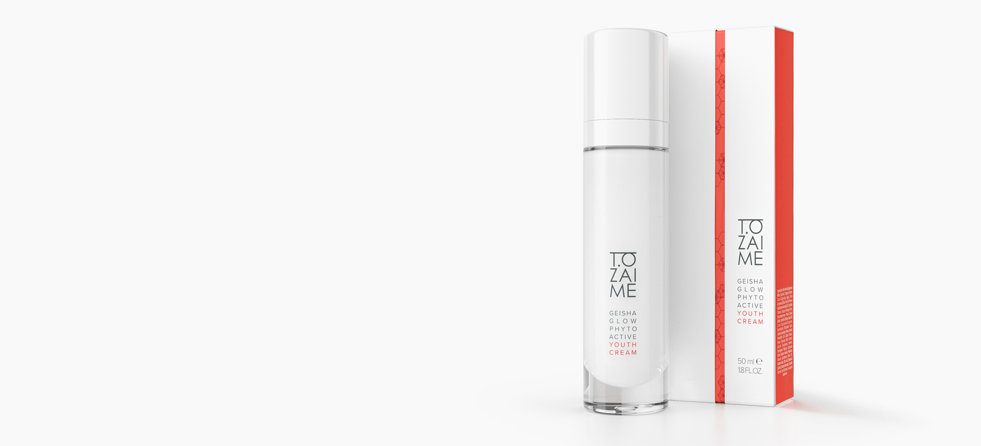
Tozaime are beauty secrets of the Geishas depicted on Japanese scrolls, perfected through innovative ingredients from western “phyto-science” research.
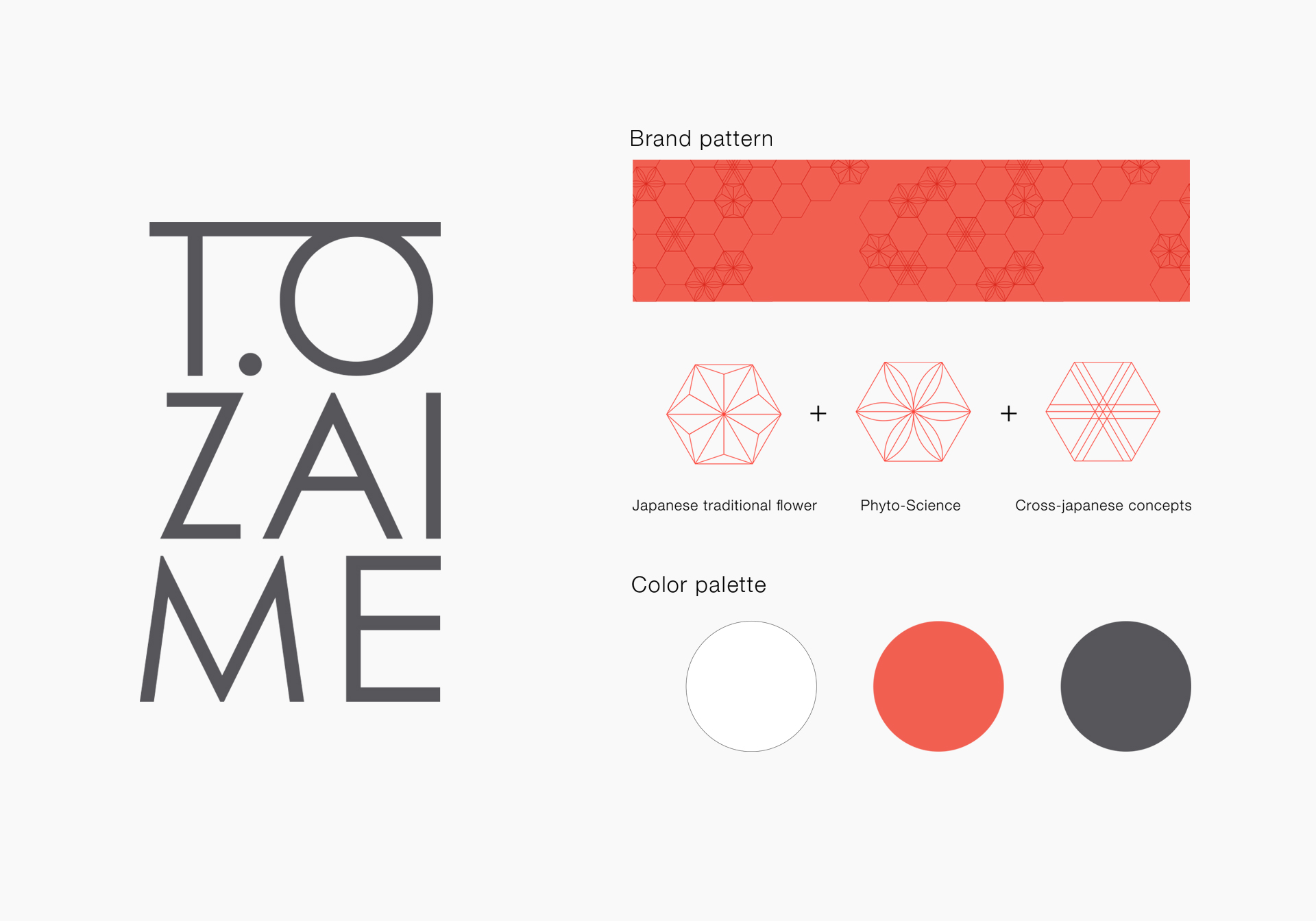
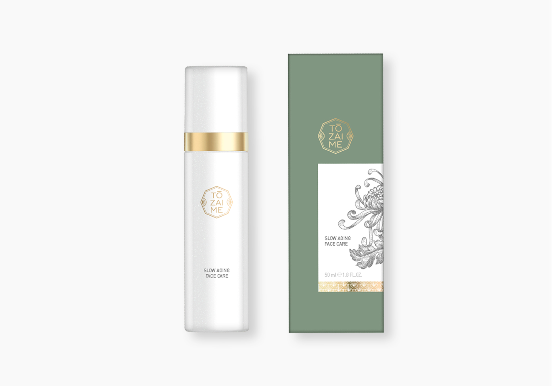
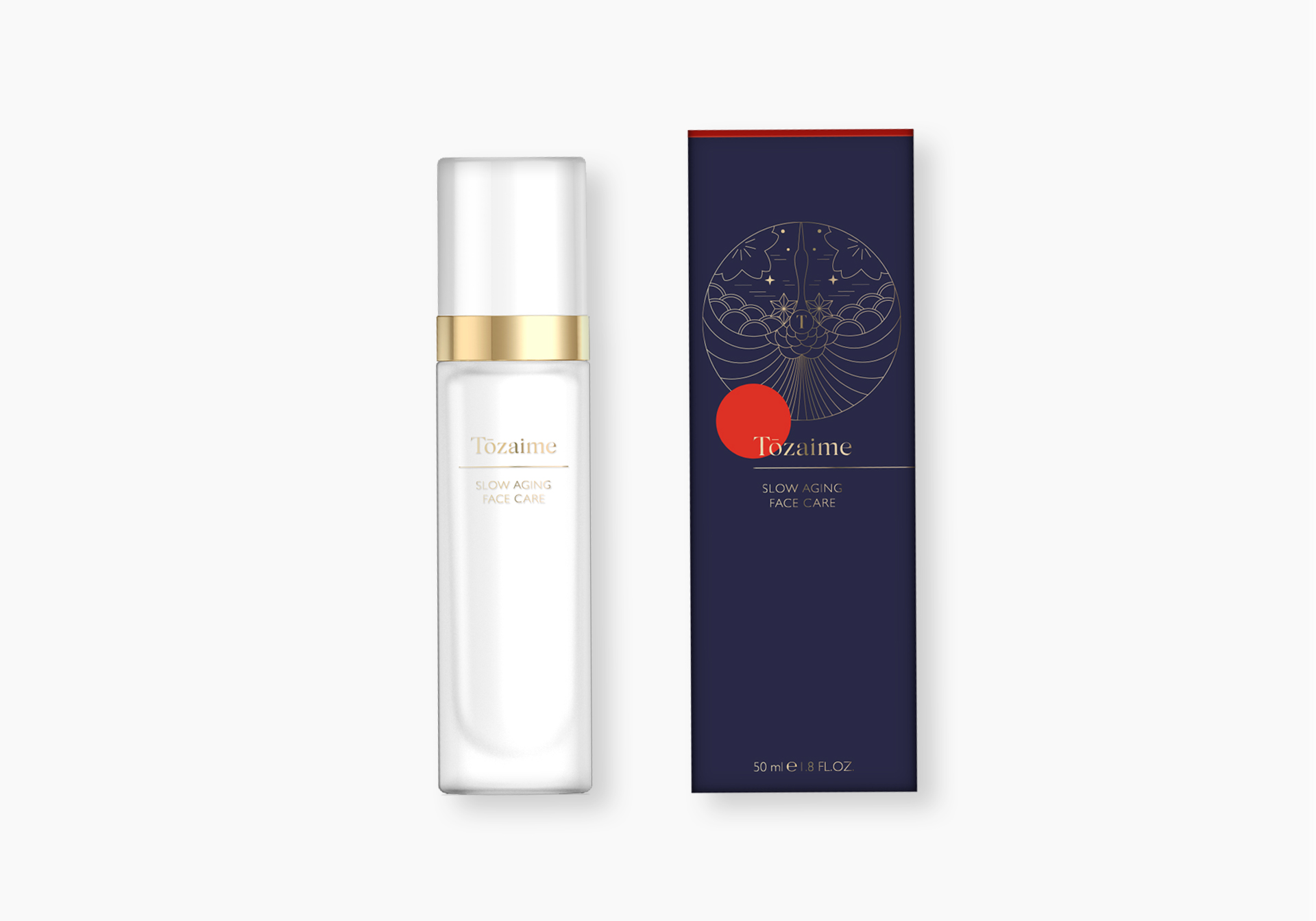
We developed for this innovative concept the brand identity and packaging. This brand connects tradition with today, nature with science, east with west. Inspired by Japanese color codes, the result is an interplay of white, red and black. The logo Tozaime is reminiscent of traditional Edo-calligraphy but at the same time it is modern and minimalistic.
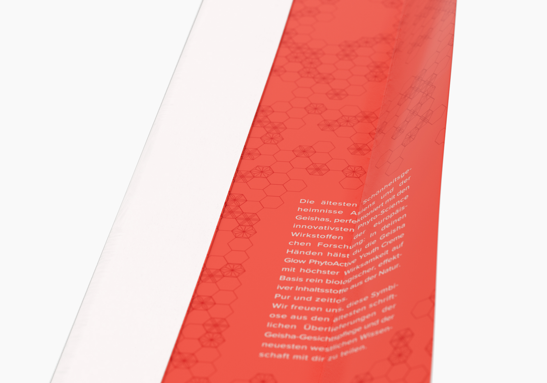
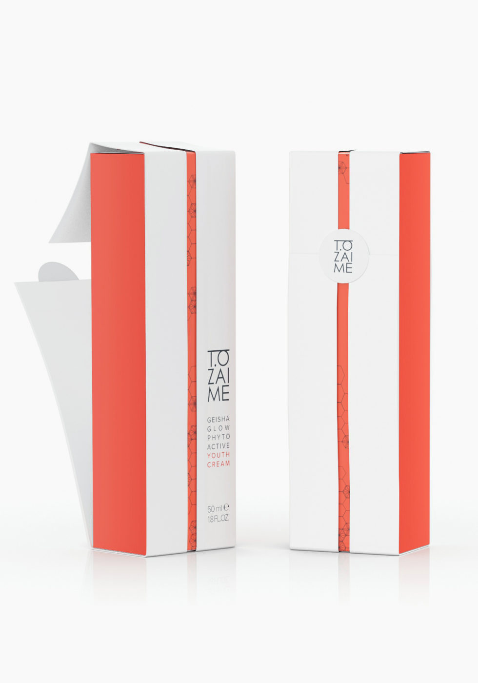
The Japanese art of folding paper into decorative shapes: Origami is a fundamental, surprising feature of the outer packaging. The outer box is wrapped in folded paper and this reveals a full red colored inside with a delicate ornamental print. A seal closes the folding element, securing the naturalness and skin compatibility within. The result is a delicate and premium, but at the same time modern brand identity.
