Beauty / Personal Care
Nivea Q10 & Cellular Face Care
Nivea Cellular
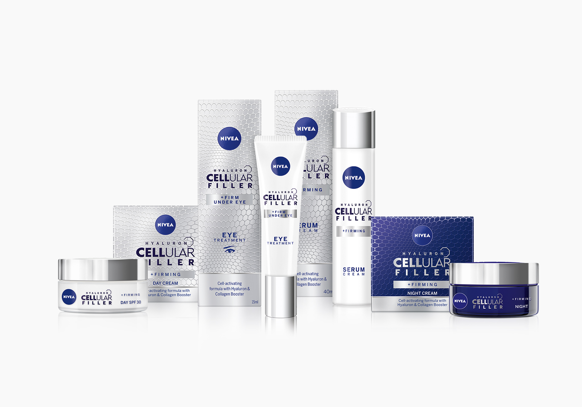
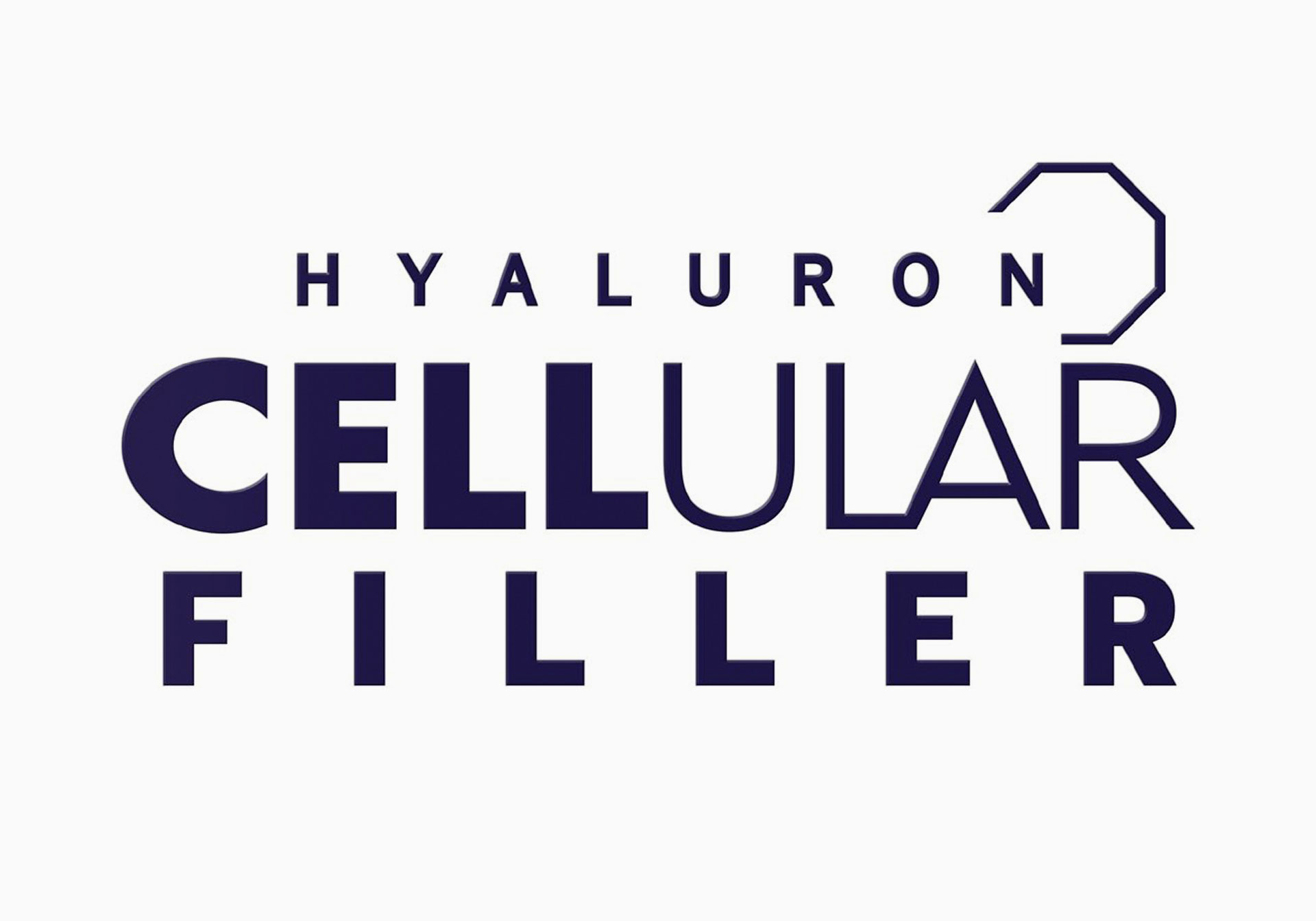
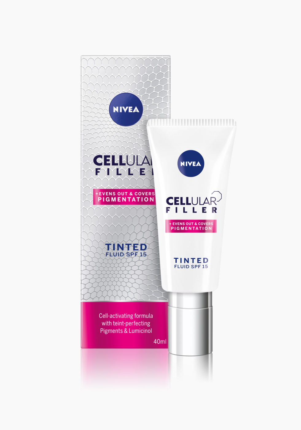
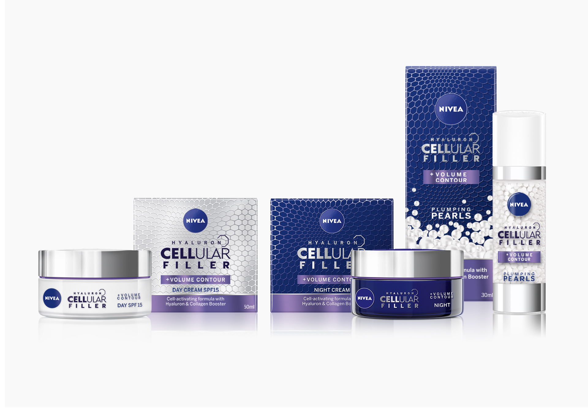
The design is graphic, minimal, clearly structured and brought alive through a matt- glance effect. The logotype Cellular is decorated with a self- explanatory icon. The active ingredient Hyaluron is integrated naturally in this branding.
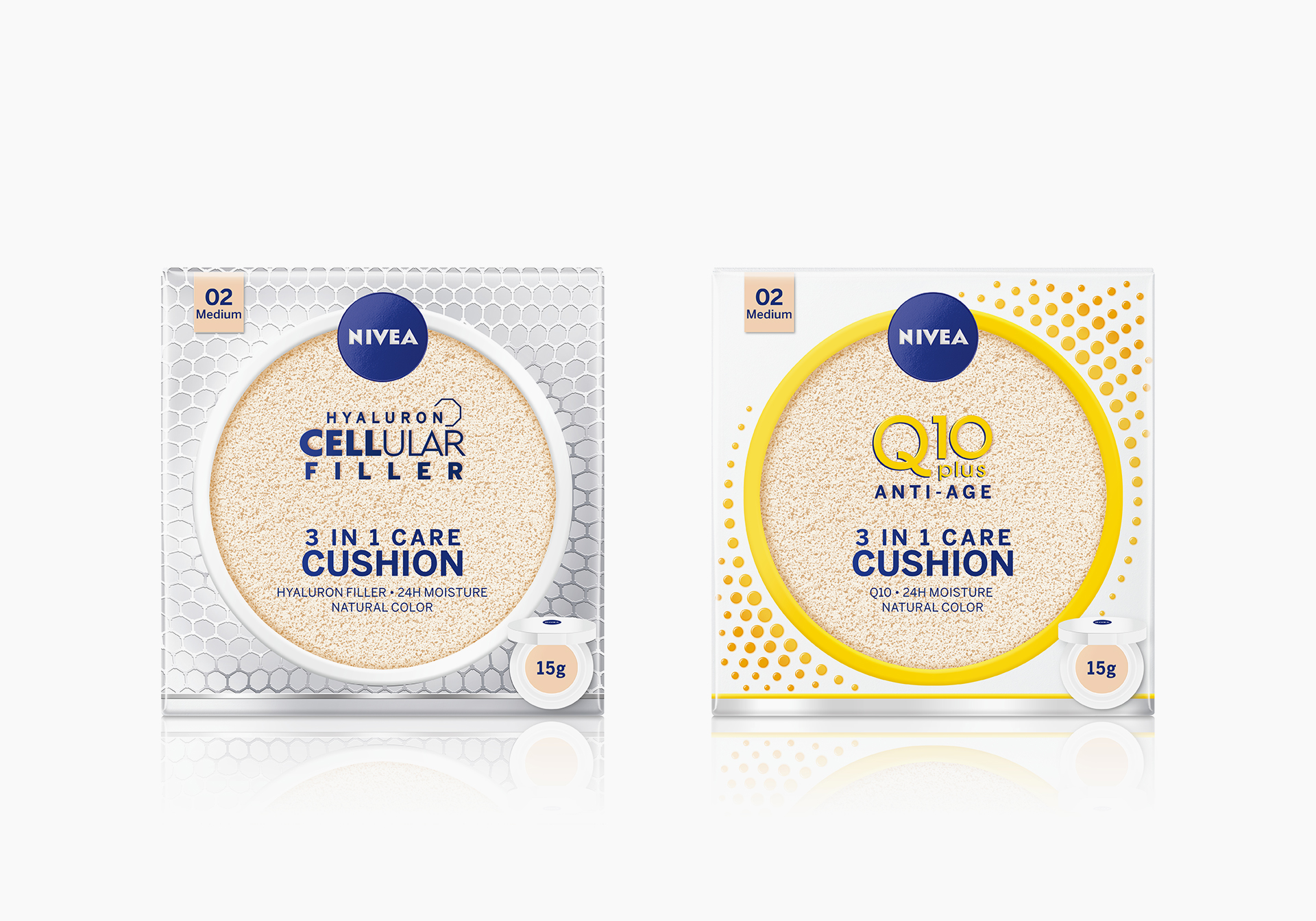
Nivea Cellular & Q10 3in1 Cushion
This new beauty care product nourishes and acts as base for the skin at the same time. Beauty competence of this product formula is demonstrated through the cushion in the center itself which is visible through a window.
Endorsed with the technical design expertise of Cellular and Q10, the product is integrated into these segments and highlights the innovative beauty character.
Nivea Q10
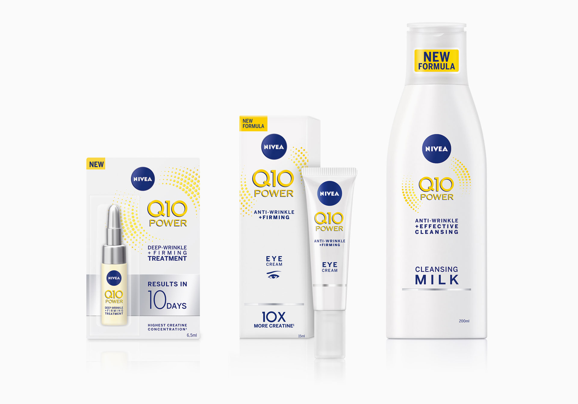
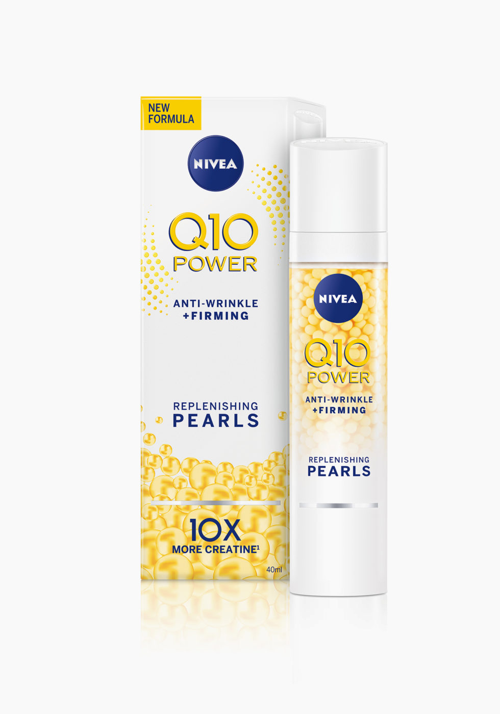
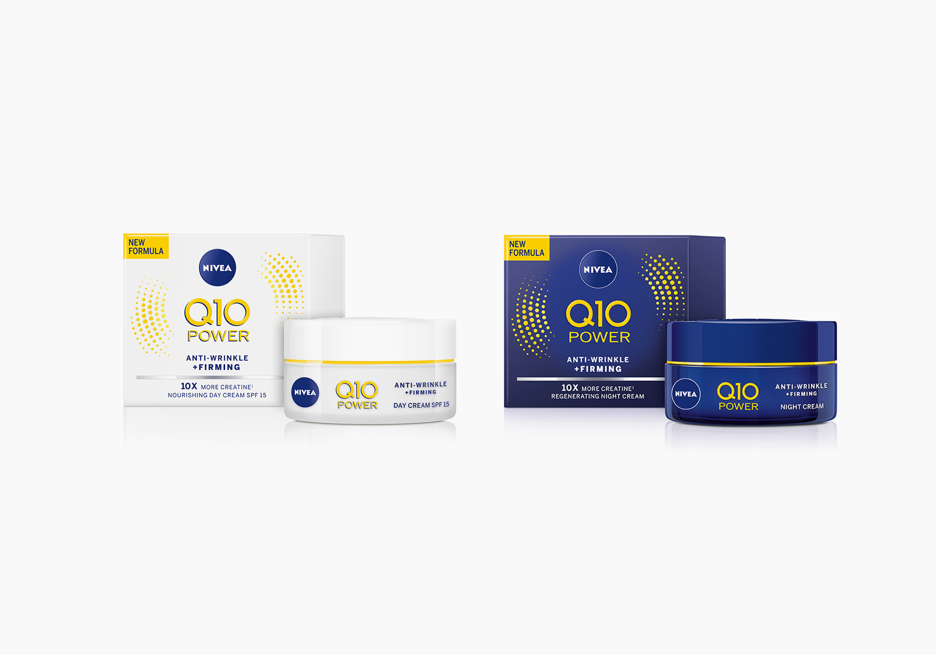
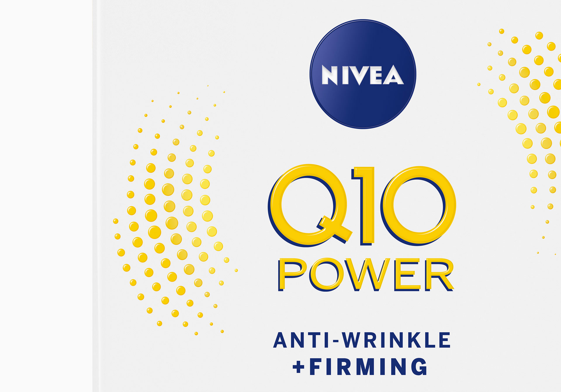
During the relaunch of Nivea Face the Q10 range was the first to be redesigned with the spirit to be more modern, more premium, more graphic and to have more impact. All graphic elements were developed with the concept to make it easy to place them at point of sale and advertising. The effect of the Coenzyme Q10 is symbolized through a circular movement – consisting of so-called Powerballs.
Each graphic is colored in the color linked to the specific ingredient: Yellow for the Coenzyme Q10, Orange for Vitamin C. Another element of differentiation in regards to the skin type is the colored base panel on each frontside of the folding boxes. Details of the Powerballs are refined through embossing and varnishes.
